Writing good alt text sounds simple until you actually try

Every time I prepare an alternative text for my images, I hesitate at first and ask myself several questions:
How detailed should I be?
Do I describe colors, emotions, or just the main idea?
Is there a limit to how long it should be?
Creating effective alternative text is definitely not easy. Because it’s not just about describing an image, it’s about communicating its purpose and meaning.
Studies about importance of alt text
“Why is alt text important?” by RNIB explains how alt text enables access to images for 2.2 billion people with sight loss and why it matters for accessibility and equality.
“Communicating Visualizations without Visuals: Investigation of Visualization Alternative Text for People with Visual Impairments” is a user-study showing how alt text for complex visuals like charts must go beyond description and help users build mental models.
According to WCAG 2.2 (Success Criterion 1.1.1 – Non-text Content), every meaningful image must have a text alternative that serves the same purpose. But WCAG doesn’t tell you exactly how to write that and that’s where many teams struggle.
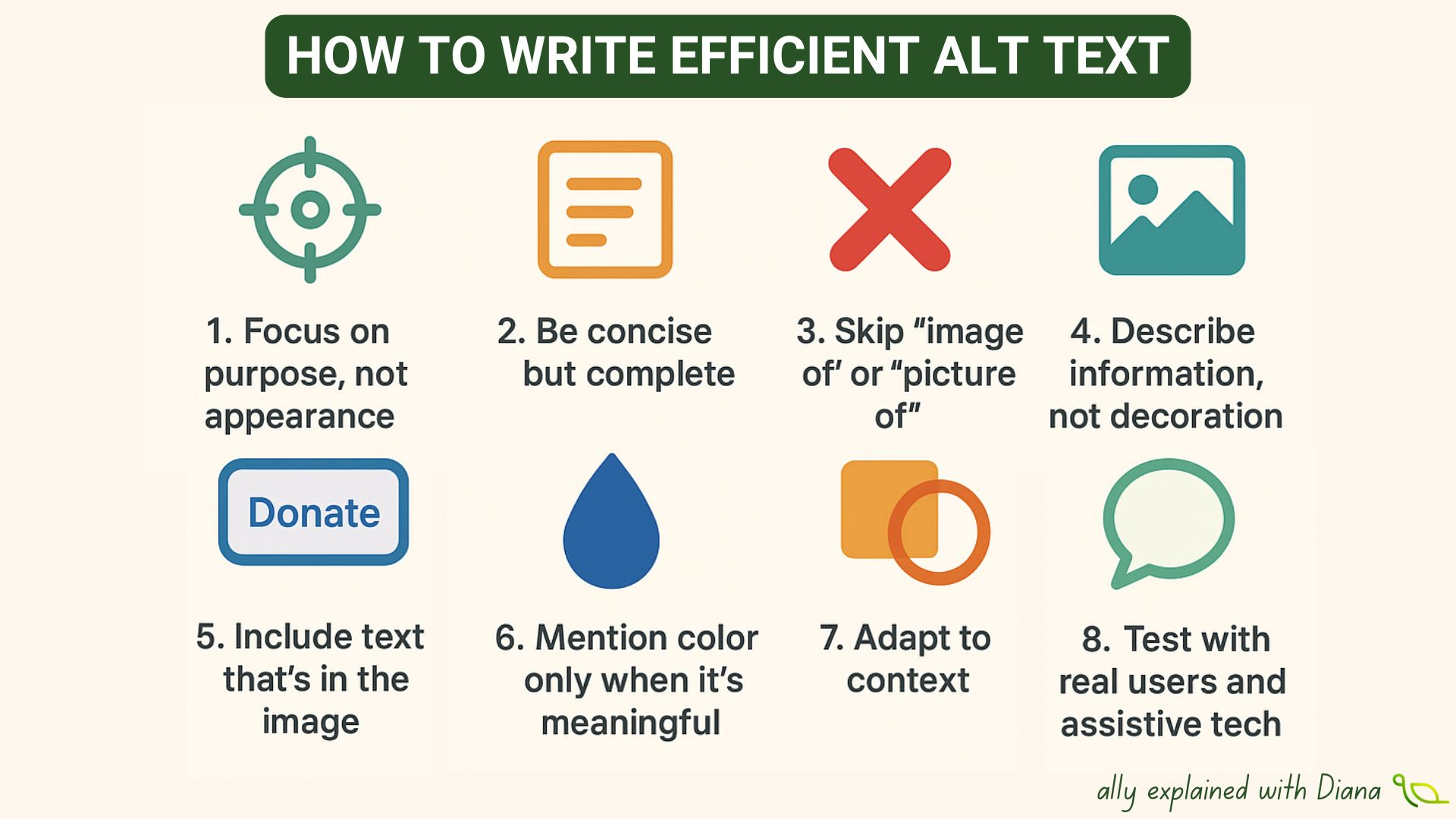
Rules that I use for writing accessible alt text
1️⃣ Focus on purpose, not appearance.
Ask yourself: why is this image here? What does it add? For example: instead of “woman smiling,” write “customer happy after receiving support.”
2️⃣ Be concise, but complete.
Alt text should be short (under ~125 characters) unless detail adds value. Use extended text (a caption or description link) for complex visuals like charts.
3️⃣ Skip “image of” or “picture of.”
Screen readers already announce the element as an image. Start with what matters.
4️⃣ Describe information, not decoration.
If the image adds no essential meaning, use empty alt (alt=”“) so it’s ignored by assistive tech.
5️⃣ Include text that’s in the image.
If the image shows visible text (e.g., a button labeled “Donate”), include it in your alt text or page content.
6️⃣ Mention color only when it’s meaningful.
Say “red warning icon” if color conveys status — but not “blue background.”
7️⃣ Adapt to context.
The same image can need different alt text in different contexts. Describe what’s relevant to that specific page, post or message.
8️⃣ Test with real users and assistive tech.
Listen to your alt text with a screen reader (NVDA, VoiceOver, JAWS). Ask youself: does it make sense in context, without visuals?
Good alt text is about describing the right things with empathy, clarity, and purpose, because accessibility is about communication.