Why placeholders cannot replace labels

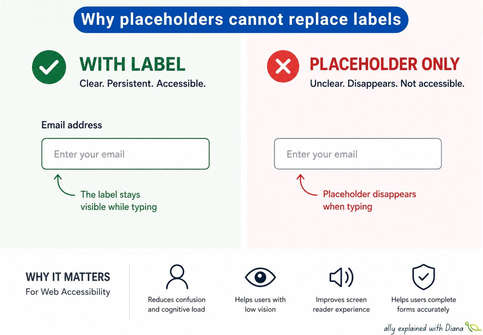
One of the most common accessibility mistakes that I observe in forms is using placeholder text instead of a proper label.
Visually, it may look clean and modern, but for many users, it creates unnecessary barriers.
If users need to understand what information belongs in a field → use a visible label.
✅ Good examples:
Email address
[Enter your email]
Password
[Enter your password]
❌ Problematic examples:
[Enter your email]
[Enter your password]
Why does this matter? Because placeholder text disappears as soon as users start typing, that means people may suddenly lose context and ask themselves:
➡️ “What was this field for again?”
This can especially affect:
people with cognitive disabilities
users with memory or attention difficulties
people with low vision
screen reader users navigating forms
A few facts that surprise many developers:
💡 Placeholder text is often displayed with low contrast, making it harder to read.
💡 Once users start typing, placeholder text disappears, while labels stay visible.
💡 Screen reader support for placeholders exists, but placeholders should not replace proper labels.
💡 Users often navigate forms by jumping between form fields and associated labels.
💡 Placeholder-only forms can increase form errors and cognitive effort.
A simple example:
❌ Search field with only:
[Search products…]
What happens after typing? The context disappears.
✅ Better approach:
Search products
[Search products…]
The label stays visible, even while typing.
Here’s a quick form accessibility checklist:
✅ Ensure every form field has a persistent visible label.
✅ Avoid using placeholder text as the only way to identify a field.
✅ Keep the purpose of each input understandable even after users start typing.
✅ Prefer clear labels such as “Email address” or “Phone number” over vague wording.
✅ Use placeholder text to provide examples or guidance — not essential information.
✅ Make sure instructions do not disappear once the field receives focus.
✅ Verify that form controls remain understandable when navigated with assistive technologies.
✅ Review whether users can complete the form without relying on memory.
✅ Maintain sufficient contrast for placeholder text and helper instructions.
✅ Clearly indicate required fields without depending on placeholders alone.
✅ Preserve context when autofill or prefilled values are applied.
✅ Reduce cognitive effort by keeping important guidance visible throughout completion.
One accessibility lesson that keeps proving itself: clean design should never come at the cost of clarity.
What’s the most common form accessibility mistake you keep seeing?