Why accessibility audit tools don’t show the same result

Last week, during a webinar about EAA I provided several express audits of the websites and later I became curious: if I replaced my manual, specialist review with automated accessibility tools, would I actually get the same picture of a website?
So I chose one website that I checked during the webinar, the most consistent problems I found manually were:
low color contrast between text and background, making content hard to read (especially for users with low vision or in bright environments)
missing visible keyboard focus, which breaks navigation for people who don’t use a mouse
carousels and moving content that can’t be paused or stopped, which can create cognitive overload and accessibility barriers for some users
alternative text that technically exists but is meaningless, like generic labels that don’t describe the actual image content
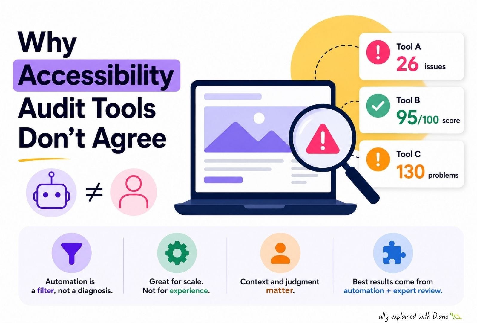
Then I tested the same website using several automated tools and the results were surprisingly inconsistent:
1️⃣ AccessibilityChecker audit tool reported:
26 critical issues
22 items requiring manual review
a “risk” score based heavily on WCAG checks and SEO-style risk framing
2️⃣ AChecker validation tool reported:
95/100 accessibility score
only 1 error and 2 warnings
yet still flagged contrast and heading structure problems
3️⃣ TAWDIS accessibility checker reported:
130 problems
139 warnings
grouped across WCAG categories with little prioritization
Why the results differ so much? Automated accessibility tools are not unified in how they define “accessibility”, each tool has its own:
➡️ rule set interpretation
➡️ scoring methodology
➡️ coverage differences
➡️ what they cannot measure
The key difference is not just how many issues are found, but what “counts” as an issue and how it is interpreted. Automated tools are very good at detecting mechanical WCAG violations - things like contrast ratios, missing attributes, duplicate IDs, or heading structure.
But so many barriers require context and human judgment, for example:
a carousel might technically be “valid,” but still unusable if users can’t pause it
alternative text might exist, but still fail if it doesn’t convey meaning
focus indicators might technically be present, but still not visible in real interaction
contrast ratios might pass thresholds, but still feel unreadable depending on typography, spacing and layout
The takeaways of this analysis:
👉 automated tools are a filter, not a diagnosis
👉 they help scale checks, but they cannot evaluate lived user experience
👉 real accessibility requires combining both automation and expert review