5 most common web accessibility issues

If you’re looking for a checklist to make your website accessible, there’s a better place to start: check 5 most common web accessibility issues.
The WebAIM analysis of 1,000,000 homepages shows a clear pattern: the same problems keep appearing, regardless of industry or product type. That means accessibility is less about doing “everything” and more about fixing the things that consistently break user experience.
Here’s a practical breakdown:
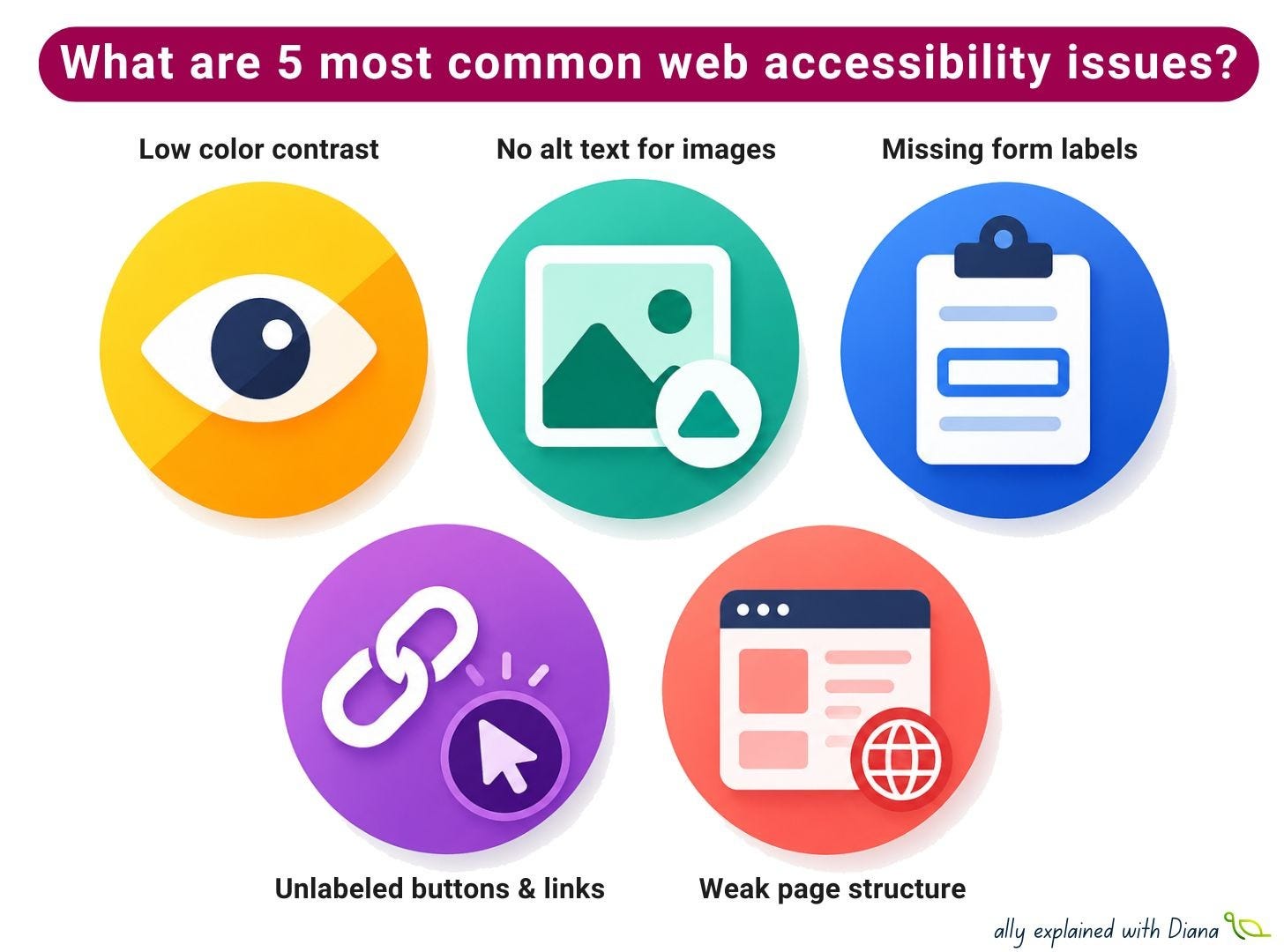
1️⃣ Low color contrast (~80% of web pages)
Can people actually read what’s on the screen?
This is still the most common issue across the web and it affects far more people than we usually assume (low vision, color blindness, temporary conditions like glare or low-quality screens).
How to avoid it:
check contrast during design, not after implementation
don’t rely on color alone for meaning
test text on backgrounds, images, and disabled states
pay attention to small text and secondary UI elements
2️⃣ Missing alternative text for images (~60% of web pages)
What information disappears if the image can’t be seen?
Images without proper alt text are still one of the most frequent barriers, especially when images are used as links or icons.
How to avoid it:
describe function, not just appearance
use empty alt (alt=”“) for decorative images
make linked images meaningful for screen readers
avoid “Image of…” unless it adds value
3️⃣ Missing form labels (~50% of web pages)
Can users actually understand what to fill in?
Forms are where accessibility directly affects business outcomes. If a field isn’t properly labeled, some users simply can’t complete it.
How to avoid it:
always connect inputs with real labels (<label>)
don’t rely on placeholders as labels
keep forms predictable and structured
test with keyboard navigation
4️⃣ Unlabeled buttons and links (~50% of web pages)
Do interactive elements make sense out of context?
Buttons that say “button” or links that say “click here” are still very common, usually caused by missing accessible names or icon-only controls.
How to avoid it:
add labels to icon-only buttons
make link text meaningful on its own
avoid generic phrases like “read more”
check screen reader output for clarity
5️⃣ Weak page structure: headings, language, landmarks (~20% of web pages)
Can assistive technologies understand how the page is organized?
When structure is missing or inconsistent, navigation becomes slow and confusing, especially for screen reader users.
How to avoid it:
use headings in a logical order
set page language (lang) correctly
prefer semantic HTML over ARIA hacks
use landmarks for navigation regions
Which of these issues do you see most often in real projects?