10 ways that make life easier for screen reader users

When people hear “screen reader,” they usually think it’s a tool only for people who are blind. But that’s not the whole story.
Screen readers are used by a wide range of people — not only those who are blind or have low vision, but also:
🧠 people with dyslexia or ADHD who find it easier to listen than read,
📱 people with eye strain or migraines who can’t always look at screens,
🌍 and even sighted users who prefer to listen to long articles while walking, cooking, or commuting.
It’s a reminder that accessibility isn’t about disability alone — it’s about human diversity.
And yet, for millions who rely on screen readers daily, many websites are still like locked doors. Buttons without labels. Images that say nothing. Headings that jump from H1 to H4 like stairs missing steps.
According to WebAIM’s Screen Reader User Survey 9 (2023),
👉 over 70% of users rely on mobile screen readers every day,
👉 and 97% encounter inaccessible websites every single week.
The good news: most barriers can be fixed with a few simple habits that make your code cleaner, your structure clearer, and your site easier for everyone.
Here are 10 things that make life easier for screen reader users and better for all users too (a full list is in my article on Substack):
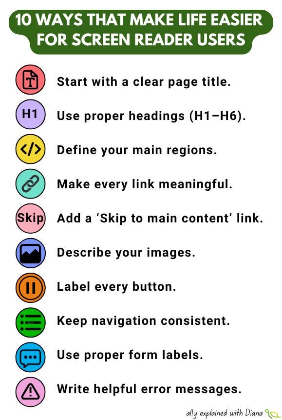
Start with a clear page title.
It’s the first thing a screen reader announces. Without it, users don’t know where they are. Imagine opening a book with no cover — that’s what an “Untitled Page” feels like.
Use proper headings (H1–H6).
Headings are how users navigate content. Skipping levels is like removing road signs. 92% of screen reader users use headings to browse faster (WebAIM).
Define your main regions.
Use <header>, <main>, <footer>, <nav> to help users jump across sections instantly.
Make every link meaningful.
“Read more about our pricing” is better than “Click here.” Users can skim links out of context, so every word matters.
Add a ‘Skip to main content’ link.
It saves time by skipping repetitive menus. For daily users, this saves hours each year.
Describe your images.
A good alt text paints a picture. A missing one is just silence. WebAIM’s study found that two-thirds of homepages still have missing or empty alt text.
Label every button.
“Button, unlabeled” is a dead end. Add aria-label or visible text so the action is clear.
Keep navigation consistent.
Predictability = independence. Changing menu order between pages breaks trust.
Use proper form labels.
Screen readers need <label> tied to each input. Placeholder text disappears too soon.
Write helpful error messages.
“Please enter a valid email address” is better than “Error.” Context = dignity.
Keep focus visible and logical.
When users tab through elements, they need to see or hear where they are.
Avoid automatic pop-ups or focus traps.
Losing focus means losing access. Always return focus where it belongs.
Don’t use empty headings or links.
They add confusion and noise. Every element should have a purpose.
Keep the reading order logical.
What looks right visually may sound chaotic in code. Follow a natural flow in the DOM.
Test with a screen reader.
VoiceOver (Mac/iOS), NVDA (Windows), or TalkBack (Android). Spend 5 minutes trying to navigate your site without looking. You’ll hear accessibility in a whole new way.
Accessibility for screen reader users isn’t charity or compliance — it’s communication.
It’s how we make sure that every person, no matter how they access the web, gets the same story, the same value, the same respect.
The web is read by eyes, but understood by minds — and sometimes, by ears.